A landing page is an effective way to drive sales for any business. The majority of websites share a similar range of assets — about us pages, contact pages, etc. But a great landing page is something that takes time to produce.
Landing page designs will vary, depending on the industry that you’re in. However, most effective landing pages have a few key elements in common that make them successful.
1) Negative Space is Key
A cluttered landing page will confuse your message. Sure, your landing page can have tons of information on it, but organize it and break it up into manageable chunks.
2) Page Layout & Placement of Elements
It is important to have your most high impact visuals above the fold, or where the viewer can see when they arrive on your landing page.
Have a video, a few important bullet points, and a direct call to action above the fold. You’ll find this on many effective sales and marketing pages.
Below the fold is a good place to expand on the product or service that you’re offering. Just remember to keep the layout consistent and clean. Like in our previous point, too much clutter can clutter your message, too.
If they don’t have an easy path from one content section to another to follow, visitors will get frustrated and just leave the site altogether.
Break up long content with variations, such as having a section of bullet points for benefits, and then a section of icons or graphics to keep it interesting.
In short, mix it up a little.
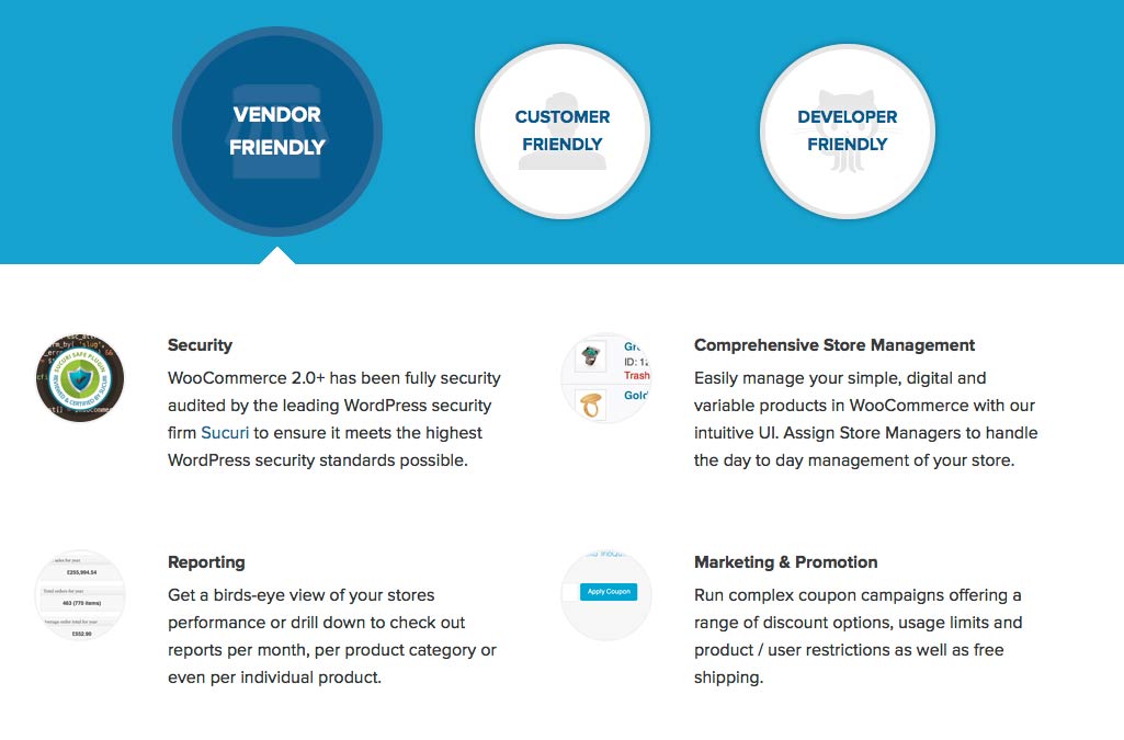
Woocommerce is a free ecommerce toolkit for WordPress. Their landing page features a promo video, and a lot of benefits and features are spread out on the page.
Nothing is crammed together. The content has room to breathe, and each key point is divided into its own section.
I also like how they shorted what could have been a very long page with circular elements that act as tabs. This makes the site clickable and interactive, and adds an explorative sense to the site.
The layout is also varied, with each section being a different number of columns to break up a huge amount of content visually.
3) Invest Time and/or Money in Great Imagery
With any web page, especially a landing page, you want to make sure that you use images that grab the visitors attention. One of the strongest ways to make a connection with a visitor is to use a powerful, emotional connection with them.
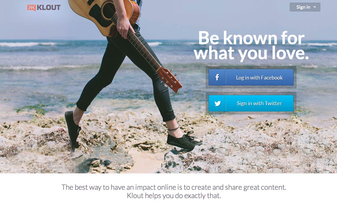
Klout’s landing page features someone walking along the beach with a guitar. The image is beautiful and gives a care-free fun vibe to the site. The concept is to show that you can share great content that you enjoy. The tagline “Be known for what you love” exemplifies this idea.
4) Include a Powerful Call to Action
People need to be told what actions to take. The landing page itself is meant to inform, and get them hooked.
The call to action is meant to tell them what the next steps are, such as entering their email address, or clicking a button to sign up or learn more.
A call to action should always stand out, Whether they stand alone on the page, or they are overlaid on top of an image. The text should contrast well with the button or background as well. Clarity is a major factor with any call to action. You can lose a lot of potential customers by not being clear on what you want from them.
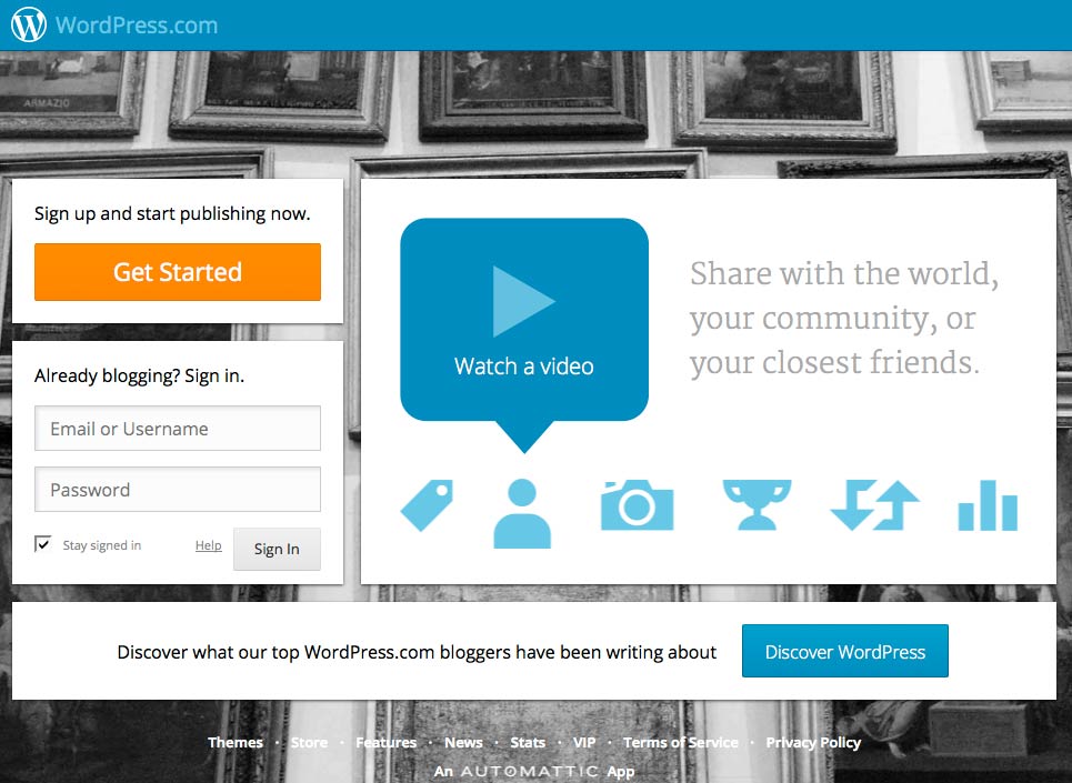
WordPress is one of the most popular blogging platforms out there. Their dot com site features a grey background, where they trustworthy blue stand out against the background.
The only other color on the page is their call to action button, which is the first thing you see, because it is bright orange. The orange is a complementary color of the blue they’ve used, creating the most contrast possible.
5) Use Practical, Trustworthy Colors
The psychology of color is important, especially with a landing page. Any time that you are asking something of anyone, they are immediately skeptical. You want to use colors that represent good qualities.
For example, blue is a great landing page color, because it represents things like cleanliness, freshness, and tradition.
Green is also another popular color for landing pages. The reason that green works so well, is because it is associated with growth, money, and life.
Colors like yellow and red are usually avoided, because of their connections with fear, cowardice, and anger.
However, this is all a matter of context as well.
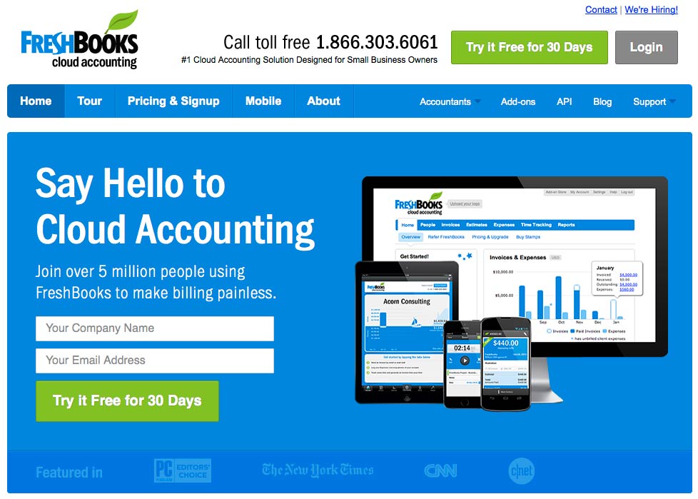
Notice how Freshbooks incorporates a lot of what I have already mentioned rolled into one site.
They use a combination of blue and green colors, dedicated content above the fold, a strong call to action that stands out, and the image shows how Freshbooks is available on all devices, making your accounting accessible from anywhere.
I also like that they have social proof, such as mentioning that 5 million people use it, and they show at the bottom that they’ve been featured on reputable sources, building trust with viewers. Below the fold is more information, testimonials, and a video.
6) Social Proof Wins
Testimonials can make a huge difference when it comes to conversions.
When you are trying to convince others to do something for you, whether it is giving you their email address, or signing up for a monthly subscription, it’s tough to build trust.
When you place testimonials from others that talk about how the product or service benefitted them, it gets the reader to place themselves in their shoes.
The reader will ask themselves, “Do I have problems like these?” If they do, then they will be more likely to see that it will work for them, too via comparison. Being able to identify with your target market and solve their problems is a great way to get conversions.
Also, psychologically, no one wants to be the first person to do something. If they see that other people, in similar circumstances have taken the leap, and it worked for them, then they should see the same results.
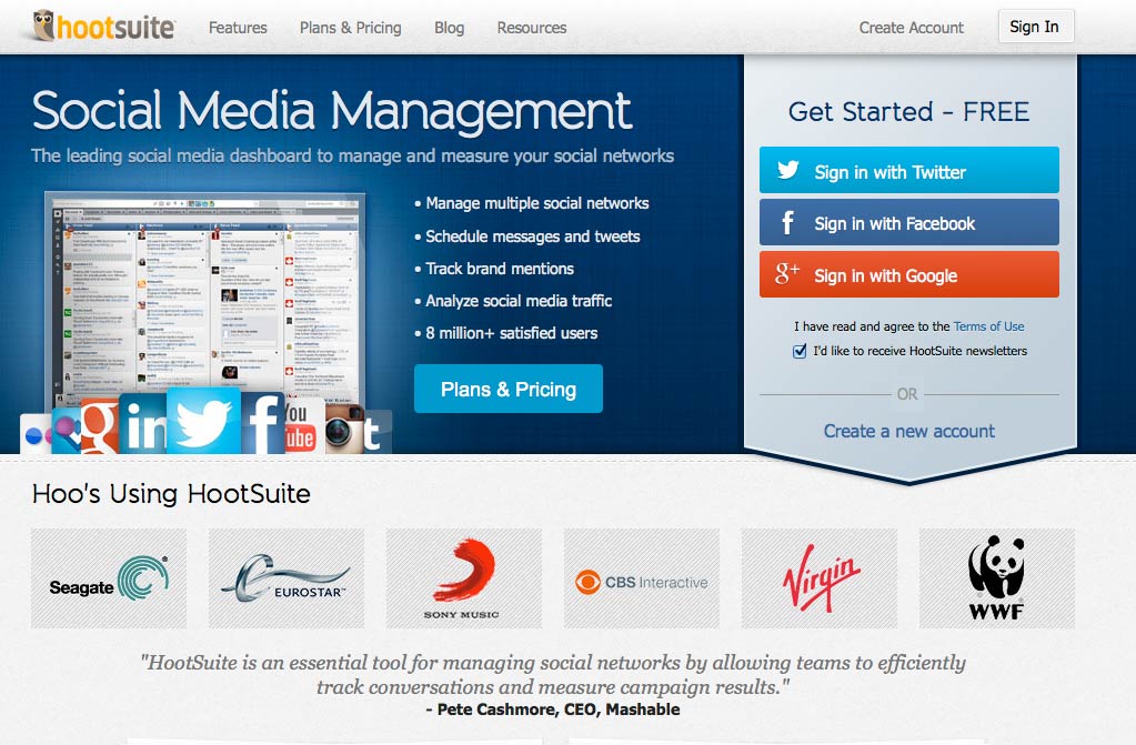
Hootsuite is a social media management hub to make posting tweets, Facebook posts, and other social media interactions easier.
Their landing page has a good structure above the fold.
One of the last things that you see above the fold is the testimonial by Pete Cashmore, Ceo of Mashable. If you can get a big name to endorse your product or service, their testimonial can generate instantly credibility for you.
On Hootsuite’s site, it is the last thing you see before having to scroll, and leaves a lasting impression.
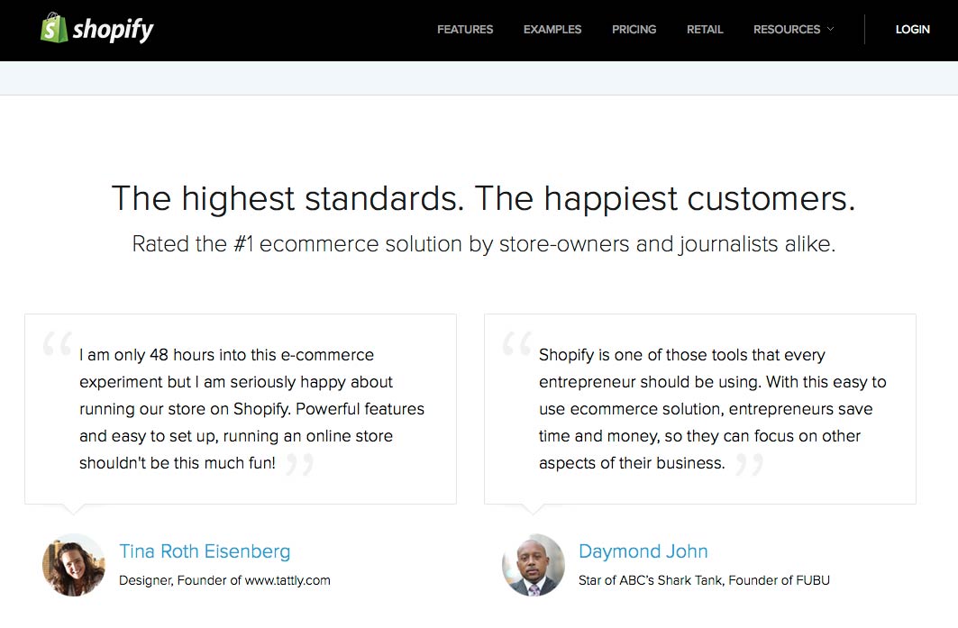
Shopify is another great example of a site that uses testimonials to promote their products. With two dedicated featured testimonials, one a site owner and another being a celebrity figure, this section adds instant credibility to their online store software.
7) Video Can Be Very Persuasive
Using a short promotional video can dramatically increase conversions on your landing page. A short, professional video is quicker and easier to watch than read the copy. Some people won’t stick around to read a lot of text.
However, if you have a compelling video, it is more likely to draw them in, and they are much more likely to stick around and read the text to find out the details.
Video also helps to build a personal connection with your visitors. Seeing a face or hearing a pleasant voice is a much nicer experience than reading a long page of sales copy. It also gives them the opportunity to see your product or service in action during the video.
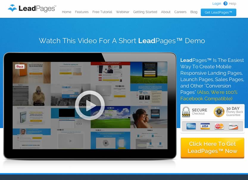
Leadpages is a service for building landing pages.
Above the fold, they have a short demo video that combines facts, statistics, and a live demo of their products and services that show just how easy it is to build an effective landing page with their products.
The text above the video tells you what to do first, which is to watch the video. After watching the video, you end up reading the text on the right hand side, with a guarantee and a call to action button to go ahead and sign up.
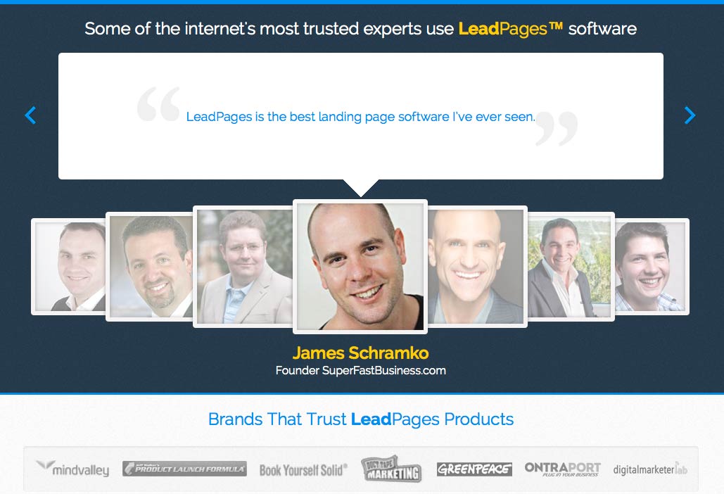
Below the fold, Leadpages uses a rotating testimonials section, featuring industry leaders who have used their service and found success with it.
Everyone wants to use products that other successful people are using. This immediately establishes the credentials of Leadpages. and cements their credibility.
Right below it, they show social proof with big brands and successful companies that use their service too.
So there’s your checklist to compare your site against.
Keep in mind that small changes to these elements can result in big wins, but always try to A-B split test your changes. Sometimes factors combine to produce unpredictable results.
Theories are great, but ultimately it’s the numbers that tell the story.
James George is a professional web developer and graphic designer. James is an expert in design, and a professional web developer, with a special interest in WordPress. Founder of Design Crawl, James has been a professional designer since 2005.

