While the original Star Wars trilogy of films were revolutionary in many ways, the simple decision to portray a sci-fi universe that showed wear and tear was a surprisingly big deal at the time.
Until then ‘space’ in movies had been all shiny chrome UFO saucers and swishy kubrick-esque ship interiors. George Lucas’ universe had more than its share of slime and gunk, and scratches, dents and dings. It felt more familiar than it probably should have.

In our real world, we often use those same wear patterns to guide us.
For instance, arrive at a big city train station, airport or church for the first time and, chances are, you’ll be able to find your way outside by just following the shiny path scuffed into the floor by millions of feet.
Who needs signage?
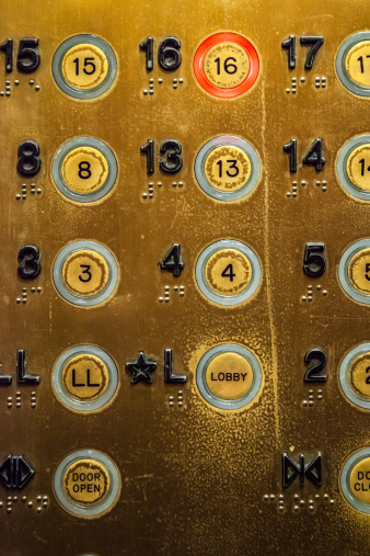
Or look at an old elevator panel to see where people have been going most often.
Even in a cafe or waiting room, you can probably pick today’s newspaper from the pile simply by the crispness of the paper. We instinctively know well before seeing the printed date.
By comparison, the web is a conspicuously clean place. Millions of people might pass through Google every hour without leaving a single scuff or fingermark. It’s super clean and clinical but even though we may have been there thousands of times, there’s no obvious evidence of our past journeys.
Is it possible to give users useful cues about the state of a system without adding extra text clutter to our designs?
Trello and the Age of Pirates
If you haven’t used it, Trello is a card-based project management system, and they’ve recently introduced a nice alternative approach to their UI. It’s a option in their settings that they call ‘card aging’.
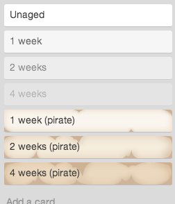
Predictably, all newly minted Trello cards have clean white backgrounds and sharp, dark text. You can almost smell that ink drying.
But as time passes, things begin to change. That once crisp ink begins to lose some of its contrast and the background becomes a little duller that it was. This effect becomes more pronounced with time.
The results of this effect are obvious: Your brain doesn’t have to remember and compare dates to understand their age. Like a bowl of fruit on a table, it’s clear to anyone at a glance which cards are fresh and which need your attention. You don’t seek this data – you simply can’t help noticing it.
Trello offers a more fun pirate version, where your cards accumulate sepia tones and water damage, but the simple adjustment of contrast conveys a lot of information in a shockingly digestible and convenient format.
Unfortunately if you want to see this nifty feature in action, it’s currently only available Trello gold users, and needs to be activated in your settings.
Nevertheless if you’ve ever accidently bought out-of-date bread or read an out-of-date blog post, you’ll see where this type of ambient UI information could be a very handy addition to our frontend ideas.
Originally published in the SitePoint Design Newsletter
 Alex Walker
Alex has been doing cruel and unusual things to CSS since 2001. He is the lead front-end design and dev for SitePoint and one-time SitePoint's Design and UX editor with over 150+ newsletter written. Co-author of The Principles of Beautiful Web Design. Now Alex is involved in the planning, development, production, and marketing of a huge range of printed and online products and references. He has designed over 60+ of SitePoint's book covers.